Connecting The Dots Part 4
In this series, we will examine and connect the dots, on several topics, all of which are contributing to stagflation, low interest rates, negative economic growth, and the greatest asset bubbles of all time.
After reviewing those money aggregate charts we can see the consequences of the economic convergence that is underway. Summarized:
Secular Stagnation leads to:
A. demographic shifts
B. - decreased capital Investment
C. - decreased consumer spending
D. + increased need for savings
E. + increased demand for low risk assets
QE leads to lower float:
F. - shrinking pool of low risk assets
G. + increased demand for low risk assets
H. + inflated asset prices
I. ~ unreliable pricing mechanisms
ZIRP Leads to:
J. - Penalty tax for parking in conservative asset zones
K. - decreased income from conservative assets
L. - reduced spending
M. + increased yield chasing
N. ++ QE and ZIRP synergy pouring gasoline on the fire
O. as in Oh Shit! KABOOM - artificial hyper inflation of all asset classes into the biggest bubbles in history
How does all of this end? One of three things... lets make a deal and see what's behind Door #1...
The Supply Side Melt Down
In the last crash, bond mutual funds and ETF holdings were a fraction of today's. Today's lofty PE ratios are based on future earnings, to come back to normalcy one of two things must happen: earnings must rise faster than prices or prices must decline.
We have 90 million baby boomers reducing their spending and 65 million Gen-x types whose household income cannot keep up the pace. Should the trend in economic stagnation, a lack of organic growth in corporate income, declining consumer spending and the malaise of unemployment continue, corporate income and EPS will decline.
What will happen when their numbers disappoint? Stock prices will adjust accordingly. With reduced income, how will they service all that debt? How many will default? Bond prices will adjust accordingly. On both fronts, a liquidation into the face of an ongoing liquidation in a market with limited liquidity. You finish outside Joe...
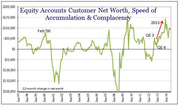
To make matters worse, margin debt levels are at all time highs, but its different this time - and it always is... total investor net worth (Free Credit Cash + Credit Balances in Margin - Margin Debt) declined to a record low since 2000 of negative -$106 billion meaning that the currently invested stock of money is more leveraged than in any previous market. Yes, you read that correctly, total investor net worth IS NEGATIVE which the graph above from Jeffrey P. Snider clearly demonstrates.
Given the tremendous amount of leverage in the system, it is a bit concerning that liquidity is becoming less abundant. As the stock market and margin debt levels rise, price volatility increases and a less severe sell off is required to trigger a collapse.
DJIA vs Margin Debt Levels

Where's Your Sign? From Elite Wealth Management... In the last two collapses, a month over month margin debt increase of 10% was a leading indicator.
Dot.com
Apr 1999 – MoM change over 10%
Nov 1999 – MoM change over 10%
Dec 1999 – MoM change over 10%
Mar 2000 – Margin Debt Peak
Mar 2000 – S&P 500 Peak
MBS
Nov 2006 – MoM change over 10%
Apr 2007 – MoM change over 10%
Jul 2007 – Margin Debt Peak
Oct 2007 – S&P 500 Peak
Today:
Jan 2013 – MoM change over 10%
Feb 2014 – Margin Debt Peak
No happy ending here, whats next? More to come as we look to see what's behind Door #2. Monty, Monty?
After reviewing those money aggregate charts we can see the consequences of the economic convergence that is underway. Summarized:
Secular Stagnation leads to:
A. demographic shifts
B. - decreased capital Investment
C. - decreased consumer spending
D. + increased need for savings
E. + increased demand for low risk assets
QE leads to lower float:
F. - shrinking pool of low risk assets
G. + increased demand for low risk assets
H. + inflated asset prices
I. ~ unreliable pricing mechanisms
ZIRP Leads to:
J. - Penalty tax for parking in conservative asset zones
K. - decreased income from conservative assets
L. - reduced spending
M. + increased yield chasing
N. ++ QE and ZIRP synergy pouring gasoline on the fire
O. as in Oh Shit! KABOOM - artificial hyper inflation of all asset classes into the biggest bubbles in history
How does all of this end? One of three things... lets make a deal and see what's behind Door #1...
The Supply Side Melt Down
In the last crash, bond mutual funds and ETF holdings were a fraction of today's. Today's lofty PE ratios are based on future earnings, to come back to normalcy one of two things must happen: earnings must rise faster than prices or prices must decline.
We have 90 million baby boomers reducing their spending and 65 million Gen-x types whose household income cannot keep up the pace. Should the trend in economic stagnation, a lack of organic growth in corporate income, declining consumer spending and the malaise of unemployment continue, corporate income and EPS will decline.
What will happen when their numbers disappoint? Stock prices will adjust accordingly. With reduced income, how will they service all that debt? How many will default? Bond prices will adjust accordingly. On both fronts, a liquidation into the face of an ongoing liquidation in a market with limited liquidity. You finish outside Joe...
To make matters worse, margin debt levels are at all time highs, but its different this time - and it always is... total investor net worth (Free Credit Cash + Credit Balances in Margin - Margin Debt) declined to a record low since 2000 of negative -$106 billion meaning that the currently invested stock of money is more leveraged than in any previous market. Yes, you read that correctly, total investor net worth IS NEGATIVE which the graph above from Jeffrey P. Snider clearly demonstrates.
Given the tremendous amount of leverage in the system, it is a bit concerning that liquidity is becoming less abundant. As the stock market and margin debt levels rise, price volatility increases and a less severe sell off is required to trigger a collapse.
DJIA vs Margin Debt Levels
Where's Your Sign? From Elite Wealth Management... In the last two collapses, a month over month margin debt increase of 10% was a leading indicator.
Dot.com
Apr 1999 – MoM change over 10%
Nov 1999 – MoM change over 10%
Dec 1999 – MoM change over 10%
Mar 2000 – Margin Debt Peak
Mar 2000 – S&P 500 Peak
MBS
Nov 2006 – MoM change over 10%
Apr 2007 – MoM change over 10%
Jul 2007 – Margin Debt Peak
Oct 2007 – S&P 500 Peak
Today:
Jan 2013 – MoM change over 10%
Feb 2014 – Margin Debt Peak
No happy ending here, whats next? More to come as we look to see what's behind Door #2. Monty, Monty?
Comments