The Fallout 8: Even More Negative Signs
Continued from Part 7. Not to be greedy, but here are even more negative signs.
Budget & Trade Deficits:
We were remiss not to include the following chart in our earlier MACRO section. The twin deficits (budget & trade) negative effect on growth.
1948 to Present, on the left, deficits are balanced, on the right, the deficits averaged over 6% of GDP, during which growth and employment have suffered.
 As this chart clearly shows, the twin deficits go a long way towards explaining why, since 1970, our economic growth and employment have gone South for the winter.
Stock market:
Record TIC Outflows: June TIC report, Foreigner's dumped record amounts of US securities. The sum total in June of all net foreign acquisitions of long-term securities, short-term U.S. securities, and banking flows was a monthly net TIC outflow of $153.5 billion, the largest ever recorded.
IPO failures: Thanks to social media and the new irrational exuberance, right back where it was before dot com went pop!

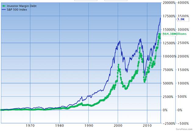
Overleveraged: The amount of money that speculators are borrowing to finance leveraged stock purchases (margin debt) has NEVER been higher. Back to 1995...

One cause may be that 78% of all defined benefit pension plans required returns of at least 5% to meet commitments while 19% needed as much as 8%.
The last 18 months...
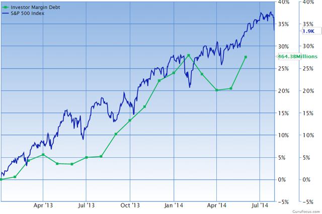
According to NYSE, margin debt levels peaked in February 2014 at $465.7 billion. For an awesome set of margin debt charts spanning 1960 till present see Praveen Chawla's post on SeekingAlpha.
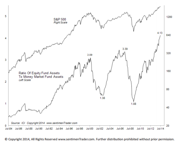
Ratio of Mutual Funds to Equity Funds:
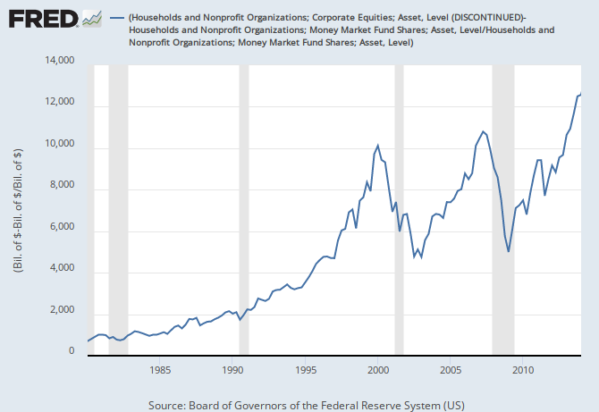 If you express the peaks of the chart above in ratios, July 2000 $3.09 to 1; July 2007 $3.39 to 1; today $4.13 invested in stocks for every $1 stored in money markets. This is the worst ratio in history.
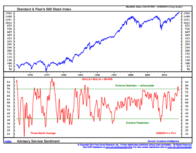
Advisor Bullishness: It's never been higher. Is that, Buy!, Buy? or Bye! Bye? Investor’s Intelligence bulls/ bulls + bears indicator is at a 17 year high, which is a bullish level not seen since the summer before the crash of 1987.
 At the other end of the spectrum, combining the VIX (volatility) and Investors Intelligence survey data shows that bearishness is at a multi decade low.

Total Market Cap to GDP: Buffet likes this metric and its only been higher once, the dot com crash in 2000.

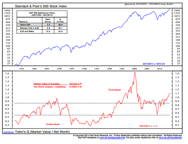
Tobin's Q: says John Q is overpaying for stocks. Measures replacement value of market assets relative to stock price. This is the second highest valuation within the last 60 years,
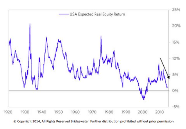
 Expected Real Return: judges the forward expected return of the stock market. The gauge is at 1%, which is the second lowest reading over the last 50 years.
Investor complacency: Until the recent pull back, the price of fear has never been lower with volatility as measured by the VIX hitting pre market crash lows.

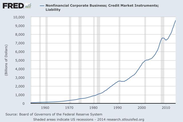
Corporate Debt Levels: At an all time high, since 2008 a 26% increase from 7.5 to 9.5 Trillion. But if they aren't investing in the future through capex or hiring, what are they using these low interest rate loans for?
The cheap borrowed money is going towards immediate gratification TODAY, through record stock buy backs and dividend payouts, collected via executive bonuses based on EPS and dividend payouts for the wealthy.
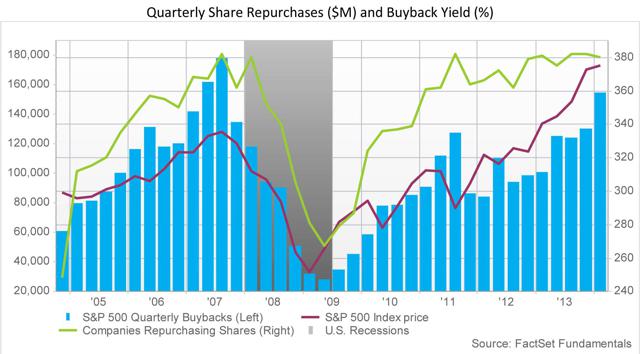
Record buy backs & dividends: Companies bolster their own bottom lines by borrowing cheap money to repurchase their own shares.
Yielding a reduced denominator of their earnings numbers and their share float. It's never been higher.

WSJ reports: S&P 500 Q1 2014 stock buybacks YOY +59.3% to $159.3 billion, a quarterly 23.1% increase over Q4 2013.
Stock buybacks FY ending March 2014, +29.0% to $534.9 billion from the $414.6 billion posted during FY 2013. The all time high was reached in FY 2007, when companies spent $589.1 billion.
Buyback and dividend expenditures combined reached a new record high in Q1 2014 of $241.2 billion, replacing the Q4 2007 record of $233.2 billion.
Howard Silverblatt, Senior Index Analyst at S&P Dow Jones Indices. "Companies... are buying more than they issued and reducing their share count. The lower share count pushed up EPS significantly (defined as a 4% impact) for 99 issues in the S&P 500, with the Q1 poster child being Apple."
Fewer shares: Since 1998 the supply of public traded stocks has shrunk by 43%. See below.
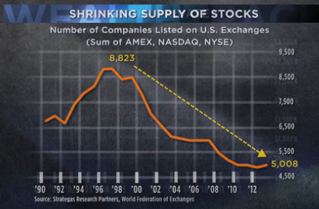
Since more money is chasing fewer shares, this puts artificial upward pressure on the stock prices.
Multiples expansion: To complete the illusion of corporate prosperity, today's stock market valuations are not based upon fundamentals...
rather "multiples expansion" which are by definition "the expanding hope of future growth and revenues" or smoke and mirrors. As Stockman put it: "the current stock averages are capitalizing a future that is a pure chimera."
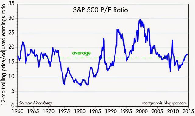
A traditional PE Ratio chart shows that we are at about 16 or the average since 1960.
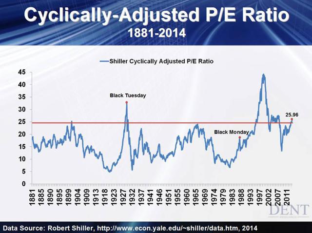
The CAPE: Robert Shiller's metric, Cyclically Adjusted Price Earnings on the S&P 500 are hovering near 25. The 20th century average is 15.2. Note where levels over 25 have occurred shortly before major market crashes.
Flying in the face of all the above and an example of do as I say, not as I do...
Insider stock sales: In late December 2013, the insider buy sell ratio hit an all time high of 577 to 1, this was an early indicator.

Buy/sell ratios don't necessarily tell the whole story, sometimes you need to watch the executive management and directors, while excluding the large share holders.
Corporate officers and directors in recent weeks have sold shares of their company's stock at a 6 to 1 ratio. That's more than double the average adjusted ratio since 1990.
In mid March WSJ reported, the volume and amount of insider sales has not been this bearish since 1990.
What do they know? If upside prospects are so good, why are so many selling?
The Nattering One muses... Perhaps the insiders are all too aware of the ponzi scheme exemplified by overleverage, record buy backs and multiples expansion.
Over the last six years, $4 Trillion in Fed and $30 Trillion in Central Bank funny money that's been printed, along with ZIRP...
all that stimulus has not produced the preferred result, an economic recovery with wage based inflation, it has only created stagflation and what some call secular stagnation...
and has been completely perverted into the largest bubble's in history which are nothing more than propped up paper assets which create the illusion of wealth.
Nothing backs that paper other than false hope, and a greater fool willing to pay such a high price for it today.
You can check the posts on this site to reference how many times we have Nattered, ad nauseum, about all these things...
Real durable economic growth, not service sector McJobs, declining consumer spending, non existent cap-ex, negative real economic growth (GDP)...
the government, under both Democratic and Republican administrations, massaging the numbers and in essence, not telling the truth and lying to the public...
and it seems that the chickens are all coming home to roost, at the same time. The $4 Trillion question is not if, but when? More to come in Part 9.
Shoutout and Tip-o-the-hat to: Jesse Colombo at Forbes for quite a few of these wonderful charts. Jesse is way up into this and has 23 charts proving the stock market is heading for a devastating crash. Also to Brad Lamensdorf's Market Timing Report which says Indicators are Cued Up for a Bear Market, both are worth a look.
Budget & Trade Deficits:
We were remiss not to include the following chart in our earlier MACRO section. The twin deficits (budget & trade) negative effect on growth.
1948 to Present, on the left, deficits are balanced, on the right, the deficits averaged over 6% of GDP, during which growth and employment have suffered.
Stock market:
Record TIC Outflows: June TIC report, Foreigner's dumped record amounts of US securities. The sum total in June of all net foreign acquisitions of long-term securities, short-term U.S. securities, and banking flows was a monthly net TIC outflow of $153.5 billion, the largest ever recorded.
IPO failures: Thanks to social media and the new irrational exuberance, right back where it was before dot com went pop!
Overleveraged: The amount of money that speculators are borrowing to finance leveraged stock purchases (margin debt) has NEVER been higher. Back to 1995...
One cause may be that 78% of all defined benefit pension plans required returns of at least 5% to meet commitments while 19% needed as much as 8%.
The last 18 months...
According to NYSE, margin debt levels peaked in February 2014 at $465.7 billion. For an awesome set of margin debt charts spanning 1960 till present see Praveen Chawla's post on SeekingAlpha.
Ratio of Mutual Funds to Equity Funds:
Advisor Bullishness: It's never been higher. Is that, Buy!, Buy? or Bye! Bye? Investor’s Intelligence bulls/ bulls + bears indicator is at a 17 year high, which is a bullish level not seen since the summer before the crash of 1987.
Total Market Cap to GDP: Buffet likes this metric and its only been higher once, the dot com crash in 2000.
Tobin's Q: says John Q is overpaying for stocks. Measures replacement value of market assets relative to stock price. This is the second highest valuation within the last 60 years,
Investor complacency: Until the recent pull back, the price of fear has never been lower with volatility as measured by the VIX hitting pre market crash lows.
Corporate Debt Levels: At an all time high, since 2008 a 26% increase from 7.5 to 9.5 Trillion. But if they aren't investing in the future through capex or hiring, what are they using these low interest rate loans for?
The cheap borrowed money is going towards immediate gratification TODAY, through record stock buy backs and dividend payouts, collected via executive bonuses based on EPS and dividend payouts for the wealthy.
Record buy backs & dividends: Companies bolster their own bottom lines by borrowing cheap money to repurchase their own shares.
Yielding a reduced denominator of their earnings numbers and their share float. It's never been higher.
WSJ reports: S&P 500 Q1 2014 stock buybacks YOY +59.3% to $159.3 billion, a quarterly 23.1% increase over Q4 2013.
Stock buybacks FY ending March 2014, +29.0% to $534.9 billion from the $414.6 billion posted during FY 2013. The all time high was reached in FY 2007, when companies spent $589.1 billion.
Buyback and dividend expenditures combined reached a new record high in Q1 2014 of $241.2 billion, replacing the Q4 2007 record of $233.2 billion.
Howard Silverblatt, Senior Index Analyst at S&P Dow Jones Indices. "Companies... are buying more than they issued and reducing their share count. The lower share count pushed up EPS significantly (defined as a 4% impact) for 99 issues in the S&P 500, with the Q1 poster child being Apple."
Fewer shares: Since 1998 the supply of public traded stocks has shrunk by 43%. See below.
Since more money is chasing fewer shares, this puts artificial upward pressure on the stock prices.
Multiples expansion: To complete the illusion of corporate prosperity, today's stock market valuations are not based upon fundamentals...
rather "multiples expansion" which are by definition "the expanding hope of future growth and revenues" or smoke and mirrors. As Stockman put it: "the current stock averages are capitalizing a future that is a pure chimera."
A traditional PE Ratio chart shows that we are at about 16 or the average since 1960.
The CAPE: Robert Shiller's metric, Cyclically Adjusted Price Earnings on the S&P 500 are hovering near 25. The 20th century average is 15.2. Note where levels over 25 have occurred shortly before major market crashes.
Flying in the face of all the above and an example of do as I say, not as I do...
Insider stock sales: In late December 2013, the insider buy sell ratio hit an all time high of 577 to 1, this was an early indicator.
Buy/sell ratios don't necessarily tell the whole story, sometimes you need to watch the executive management and directors, while excluding the large share holders.
Corporate officers and directors in recent weeks have sold shares of their company's stock at a 6 to 1 ratio. That's more than double the average adjusted ratio since 1990.
In mid March WSJ reported, the volume and amount of insider sales has not been this bearish since 1990.
What do they know? If upside prospects are so good, why are so many selling?
The Nattering One muses... Perhaps the insiders are all too aware of the ponzi scheme exemplified by overleverage, record buy backs and multiples expansion.
Over the last six years, $4 Trillion in Fed and $30 Trillion in Central Bank funny money that's been printed, along with ZIRP...
all that stimulus has not produced the preferred result, an economic recovery with wage based inflation, it has only created stagflation and what some call secular stagnation...
and has been completely perverted into the largest bubble's in history which are nothing more than propped up paper assets which create the illusion of wealth.
Nothing backs that paper other than false hope, and a greater fool willing to pay such a high price for it today.
You can check the posts on this site to reference how many times we have Nattered, ad nauseum, about all these things...
Real durable economic growth, not service sector McJobs, declining consumer spending, non existent cap-ex, negative real economic growth (GDP)...
the government, under both Democratic and Republican administrations, massaging the numbers and in essence, not telling the truth and lying to the public...
and it seems that the chickens are all coming home to roost, at the same time. The $4 Trillion question is not if, but when? More to come in Part 9.
Shoutout and Tip-o-the-hat to: Jesse Colombo at Forbes for quite a few of these wonderful charts. Jesse is way up into this and has 23 charts proving the stock market is heading for a devastating crash. Also to Brad Lamensdorf's Market Timing Report which says Indicators are Cued Up for a Bear Market, both are worth a look.
Comments